

About Mark and Logo type
The first major idea is that the logo or mark should not only "express" but also "support" the context and the time of the people who come here.
The museum building itself, the air that flows in Karuizawa's atmosphere, and the world that Foujita's works hold-- Rather than trying to "express" these elements, we wanted it to be a "sign of experience" that "leads the way", "doesn't impede", "makes people feel a little nice" or "makes people feel like they are being treated with care".
For this museum, we came up with the idea of using a traditional but not too old-fashioned method called "monogramming".
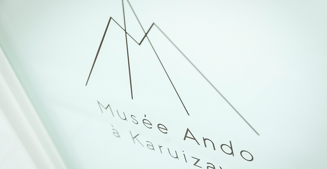
A monogram uses the initials of a name to create an icon for the active body. The 'M' and the 'A' of Musée Ando - using these two letters as the elements, we have tried to create an idea around the mark .
The logomark was decided on as type B. The logotype was then brushed up based on the same geometric proportions as the mark. The font used as the basis for the logotype was 'Neutraface2', which was designed according to a geometric discipline. Neutraface2 was also chosen because the shape of the 'a' is formal and, moreover, the upper edge of the lower circle is horizontal, allowing it to be aligned with the horizontal line of the 'ée' in 'Musée'.
While keeping the good qualities of 'Neutraface2', we brushed it up according to a more serious geometric discipline. The proportions of the lowercase letters and the width of the capital letters 'M/A/K' have been recalculated by dividing the square and were reconstructed using monospaced lines. By expressing the mark and logo with the same line width and the same design concept, the concept became clearer.
The Japanese logotype was then created.
The Japanese logotype was designed according to the same geometric rules as the mark and the French logotype.
The 'M' and 'A' monograms represent the mountains and groves of Karuizawa, and the mark/logotype has an authentic, yet modern and charming feel that is typical of a museum that exclusively features works by Foujita.
Bunpei Yorifuji
Art director

The logomark and logotype are the icon of the museum.
They are used in the museum's signage, promotional materials such as leaflets and posters, as well as on the merchandise and handbags of the Musée Ando à Karuizawa. The logo is unified with pictograms and fonts that make the mark come alive.
Creative director: Hiroshi Aizawa
Art director: Koji Sasaki
Art director: Chieko Kojima